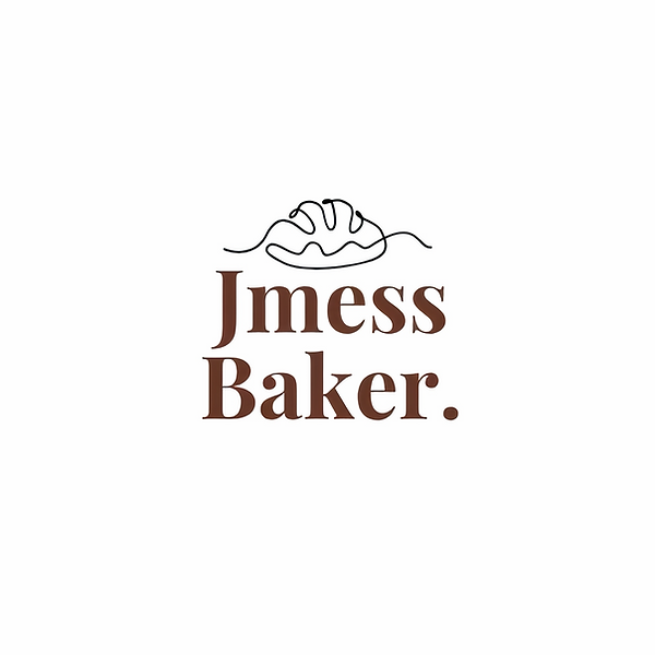
Jmess Baker is a small bakery, and I wanted the logo to feel handmade and warm, like the bread itself. I drew the loaf in one continuous line without lifting the pen, the way a baker shapes dough in one motion.
The line starts flat on the left, rises into the loaf with its scored top, and settles back down on the right, like bread rising and resting on the counter. It's imperfect on purpose, because homemade should look homemade.
For the name I picked a friendly serif in a warm crust-brown and finished it with a full stop, as if to say: this is the bakery, full stop. It feels cosy on paper bags, stickers and the shopfront.