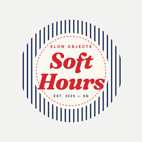
Soft Hours is a self-initiated brand concept for a small line of slow objects: soft stationery and furniture pieces for the desk and home. The identity pairs navy pin stripes with tomato-red stitched care tags and handwritten spec notes, so every piece feels like a gentle reminder to take your time. The project covers the logo system, colour palette, typography, a first product drop of three pieces, packaging labels and social launch content.
Soft Hours started from a love of Korean lifestyle goods: everyday objects presented like factory spec sheets, with handwritten notes and stitched labels. I kept that playful, product-sheet mood but rebuilt everything else as my own. I gave the brand an idea to stand on, "slow objects", and a name to match. I swapped the soft pastels for navy pin stripes and tomato red, and replaced the classic woven patch with a stitched care tag that carries the brand's voice: Open slowly, Fluff then rest, No rushing here.
From there I built the system piece by piece: a badge logo and its variations, a three-font type pairing (a bold italic serif, a condensed sans and a handwritten script), fabric patterns, and a first drop of three products, each shown on its own spec sheet. Layouts were drafted with AI assistance in Claude, then art-directed, refined and checked by hand for alignment, spacing and clean export.