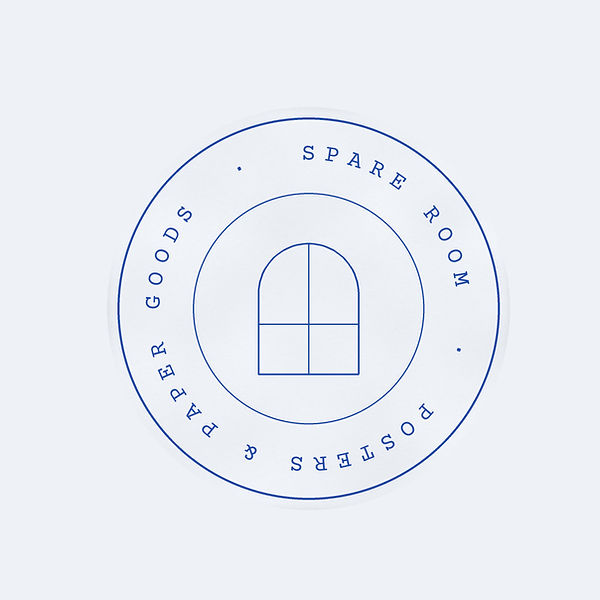
The logo started from the window. The arched window with four panes shows up in the shop's illustrations, so I pulled that shape out as the mark. For the wordmark I used a script, which gives the name a soft, personal feel that suits a shop for small things. The shop stamp puts the window in the centre of a ring of mono type, the way a rubber stamp or paper label would look. I kept it to one colour, cobalt, so it prints cleanly on paper and works on packaging.