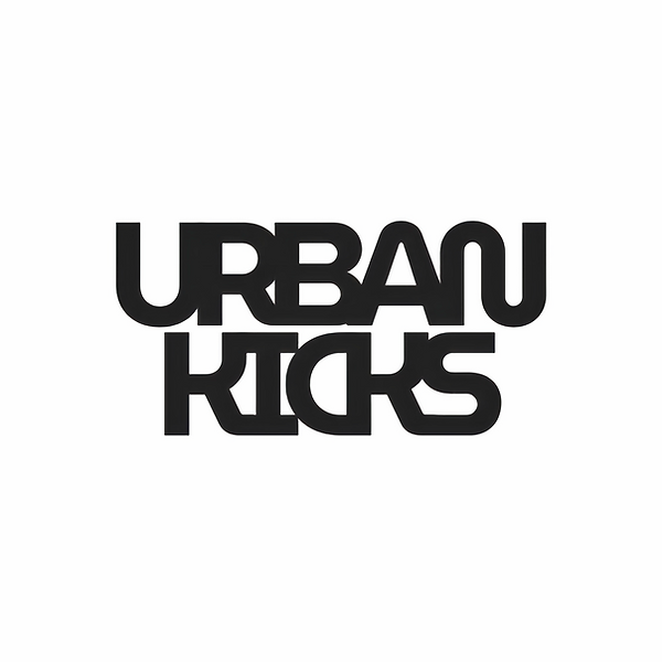
Urban Kicks is about sneakers and street culture, so the logo had to be loud, chunky and hard to ignore, like something you'd see on a shoebox or a wall.
I built it in a heavy geometric type and pushed the letters together until they started sharing parts. The R and B run into each other, the A and N fuse, and KICKS locks together into one solid block. Stacking the two words tight makes it read like a stamp or a sticker, ready to slap on anything.
I kept it pure black so it works at any size, from a tiny tongue tag to a full shopfront. The idea was simple: the letters stick together the way a sneaker community does.