A PITCH DECK IS FLAT. A WEBSITE YOU CAN POKE IS NOT.
A website built to back up a skincare brand pitch: bright, bouncy and touchable, so the idea feels like a real launch.
- CLIENT
- Private client
- YEAR
- 2026
- SERVICES
- Web Design, Creative Direction
- INDUSTRY
- Skincare / Beauty Concept
- BUILT IN
This one came from an independent client with a skincare brand concept to pitch. Slides and mockups only go so far, so she wanted a website as support: something people could open, scroll and play with, so the brand felt ready to launch rather than still on paper. The site isn't public, so this case study shows it through screenshots.


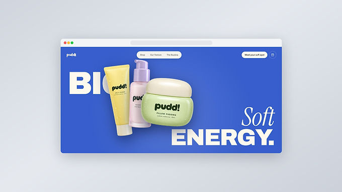

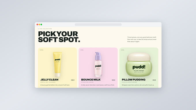
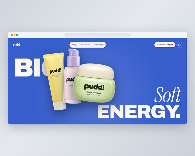
The brand is called PUDD!, and every product is named after a texture: Jelly Clean, Bounce Milk, Pillow Pudding. So I made the whole site feel soft and squishy: a bright cobalt base, pastel yellow, pink and pistachio for each product, heavy rounded headlines paired with a soft italic, and product renders covered in tiny water droplets. The copy keeps the same tone, from "Big Soft Energy" to "Very serious about soft."

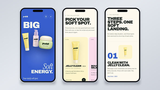
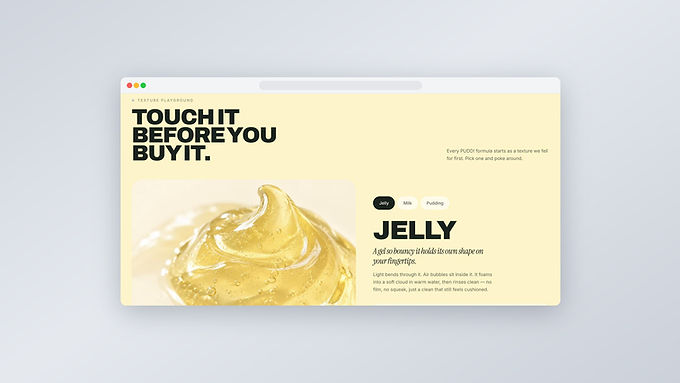
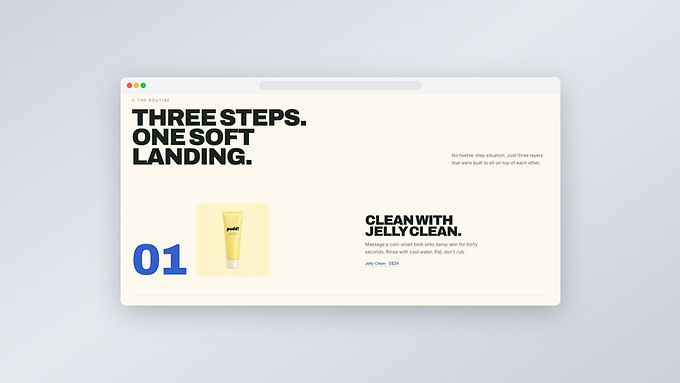
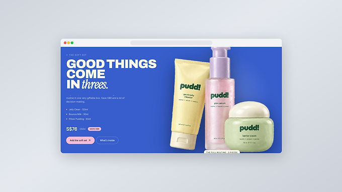
Skincare is bought on feel, and a website can't give you that, so I built a Texture Playground: tap Jelly, Milk or Pudding and the page swaps to a macro close-up of that formula with a short description of how it feels. The routine is laid out as three numbered steps, and the full set is shown as one giftable bundle with the saving upfront, so the pitch shows a complete product line and how it would actually sell.




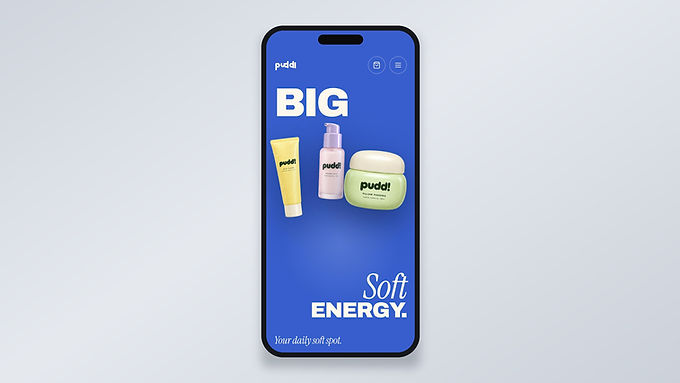
Instead of describing a brand, the client could hand over a link and let people experience it: three products, one routine and a personality you can feel on the very first screen.